Cup of Sugar
Mutual aid platform · Design research · Community resilience · 2020–present
Origin
This project began in 2020 when the pandemic revealed a long-standing issue: the infrastructure enabling neighbors to connect and assist each other had disappeared. People wanted to help, but the necessary channels were absent. Cup of Sugar responds to this structural gap—it's not just a social network but a platform focused on a specific type of exchange that existing platforms cannot support: the knock on the door.


The platform
The prototype, finished in Spring 2026, includes 22 screens that span a comprehensive design system. Its main features comprise mutual aid requests, Along the Way (for shared errands and rides), The Cupboard (material exchanges in four modes), a skills directory with a teaching layer, a time bank, community alerts with a three-state verification system, and community governance tools. Each feature embodies a specific ethical commitment—dignity, mutual aid, autonomy, data minimization, consent, information integrity, and a non-carceral approach.

Design decisions
Three screens carry the most conceptual weight.

The privacy defaults screen is the ethical centerpiece of onboarding. Two toggles default to on, three to off. Privacy is the default state, not something users have to find.
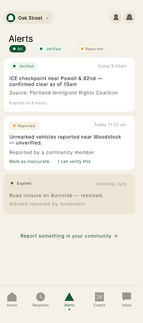
The community alerts screen employs a three-state verification system—Verified, Reported, Expired—with no automatic verification or alarmist visuals. For communities experiencing civic stress, creating such an alert system is an ethical choice.


The item detail screen in the Cupboard features the platform’s key cross-feature link. Each repair flag on an item takes users directly to the skills directory, filtered for sewing and mending skills. Repairs are recorded as time bank transactions. Goods circulate, skills facilitate repairs, and reciprocity is tracked.
The Stone Soup screen illustrates the platform's recognition that need and abundance are not mutually exclusive. It features three modes—collective making, feeding neighbors, and teaching—shared in one space because the same neighbor might post a zucchini surplus on Tuesday and then show up hungry on Sunday. The modes are distinguished solely by color: amber for collective making, green for feeding neighbors, and white for teaching. Posts in the teaching mode link directly to the skills directory and log into the time bank, whereas community meals do not—since a soup pot is non-transactional, the act itself serves as its own record.